


Is Your Kitchen Decor Making You Fat?
What if I told you that the colors and images you choose for your kitchen could have a significant influence on whether you are able to lose fat and how quickly? There is a very clear relationship between the colors of our environment and how we relate to food and eating.
Red, Orange and Yellow
Have you noticed that fast food chains all seem to use the same colors for their logos and interior decor?
This is not a coincidence, and it certainly didn’t happen by chance. The predominance of red and yellow is not there to represent ketchup and mustard (this is what my children thought)! These colors are chosen carefully to produce a particular mood in the restaurants – a mood that encourages people to eat more, and faster.
According to color experts, the colors red, yellow and orange tend to stimulate people’s appetite, especially for foods that are fatty or sweet.
The color orange has the added characteristic that people tend to eat at a faster pace. The colors red and yellow, on the other hand, are attractive in the beginning, but people tire of them quickly. In either case, table turnover is increased, which is great for business.
It is interesting that the holidays when people complain about over-eating the most and gaining weight are those that have orange and red as important decor colors.
Pharmaceutical companies are also aware of the influence colors have on people’s perception. The colors of pills are rarely connected with the colors of ingredients, but more often are coatings that were chosen by color experts as well. For example, fast acting pills are usually red, a color that moves people to action, but diet pills are more often blue. The color blue is known for reducing appetite.
Earth Tones and Green
Restaurant chains that want to target the now growing natural foods markets, choose very different colors than those found in fast food places. Their colors are more subdued, with a predominance of warm greens and earth tones, the colors of vegetables.
Organic and natural foods are more expensive, and the restaurants that cater to this market want to offer an experience that goes beyond the food to their upscale customers. These use earth tones and warm greens to create a welcoming but sophisticated environment, where people are encouraged to stay.
The term “going green” has become very widely used as a way to express greater care for the environment and health, so it makes sense that many of the logos for organic food companies also carry this color. Green has become symbolic of nature, growth, and health.
If you ask people what the color green brings to mind, they will often answer “nature” and “vegetables.” Being reminded of eating vegetables is great for a nutritional plan, but you also need to create a feeling of warmth so that you will want to sit down to eat.
Best Colors for the Kitchen to Assist with Weight Loss
As mentioned before, the color blue, especially the coolest blues, tend to suppress appetite. It would seem like a great idea to paint your kitchen blue in order to eat less, but too much blue can also depress the mood. I recommend that my clients stay within the green and blue-green shades in the kitchen, when weight loss is their goal.
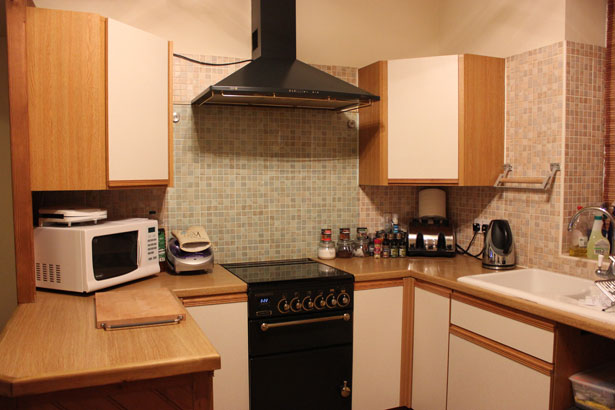
The kitchen cabinets often have a wood finish, and this brings earth tones into the space. These colors can be beautifully complemented by a warm green, such as an apple green, or by a soft teal or aqua. I have seen beautiful kitchens in hunter green, even though I personally find this color a little dark.
When losing body fat is a goal, avoid using red and yellow in your kitchen and dining areas. An excessive use of white is also discouraged, because it can give your kitchen a “clinical” feel. A similar thing happens with too much stainless steel. These spaces may look chic and modern, but because they lack coziness, people are less likely to prepare meals at home. Restaurant food almost always has more sodium, fat and sugars than home-prepared meals, so whenever you choose to eat out or get take-out meals, you will be more likely to eat fattening foods than if you prepare meals at home.
If you want to eat at home the way you would eat at a fast food restaurant, then use the colors they use, but if you want to make better food choices and be trim for life, choose the colors that health food markets and restaurants use for your kitchen and dining areas – a combination of soft earth hues with warm greens or aqua.

Moni practices Feng Shui, the art of space arrangement, and has a degree in Architecture from the Central University of Ecuador. She is the founder of Feng Shui for Us™ and developer of the Nine Steps to Feng Shui® System. Moni offers online Feng Shui training, and long distance Feng Shui Consultations. www.fengshuiforus.com